Designing A Fictional Climbing-Buddy App
Client
- University of Konstanz (Student Course)
Team
- 1 Interaction Designer
Year
- 2018
Tasks
- Concept
- Design
How can we make planning and organizing climbing trips easier?
GoClimb was a project that I did with a fellow student in a UX design course at the University of Konstanz. Although it is not a real project, I want to present it, since I like the result and especially how we got there. For more information on that, have a look down below.
GoClimb is a smartphone app, that helps climbers in planning and organizing their climbing trips to indoor and outdoor locations. Until today, this can be one of the most tedious tasks, which includes finding climbing buddies, a driver, a spot to go climbing, and checking for opening hours, occupancy of the location, or the weather forecast. The app provides a set of tools that support the climbers in these stages of organizing their trip. Climbers can select destinations and possible dates and the app will automatically look for suitable climbing buddies. As soon as a group has been found the app notifies the users and lets them connect and plan their trip. With GoClimb, it is easy for climbers to find new climbing buddies or connect with their already existing climbing group to go climbing whenever and wherever they want.
Results
The GoClimb app tackles various issues that climbers face when planning a climbing trip: Finding new climbing spots, finding climbing buddies, and organizing the trips. The app takes inspiration from travel apps such as BlaBlaCar but fits their process towards the specific needs of climbers.
Find new Climbing Locations
Provide an extensive set of climbing locations, easily explorable via a map. A variety of available filters makes it easier to browse through the locations.
Find trusted Climbing Buddies
You are new in town and don’t have anyone to go climbing with? Or your friends can’t be bothered to go climbing this week? Just create a trip and find new climbing buddies to accompany you on your trip.
Organize your Climbing Trip
With GoClimb you set the location and date of your trip in advance. GoClimb automatically searches for climbers that want to go climbing on the same date and at the same location. This way you just have to settle on a pick-up location and you’re ready to GoClimb!
Process
In this project, we went through the complete user-centered design process (except for evaluation). We started by interviewing climbers about their needs and issues, continued with modeling the problem and design space, sketched initial ideas and created wireframes, and finished with designing the app.
Investigating the Problem Space
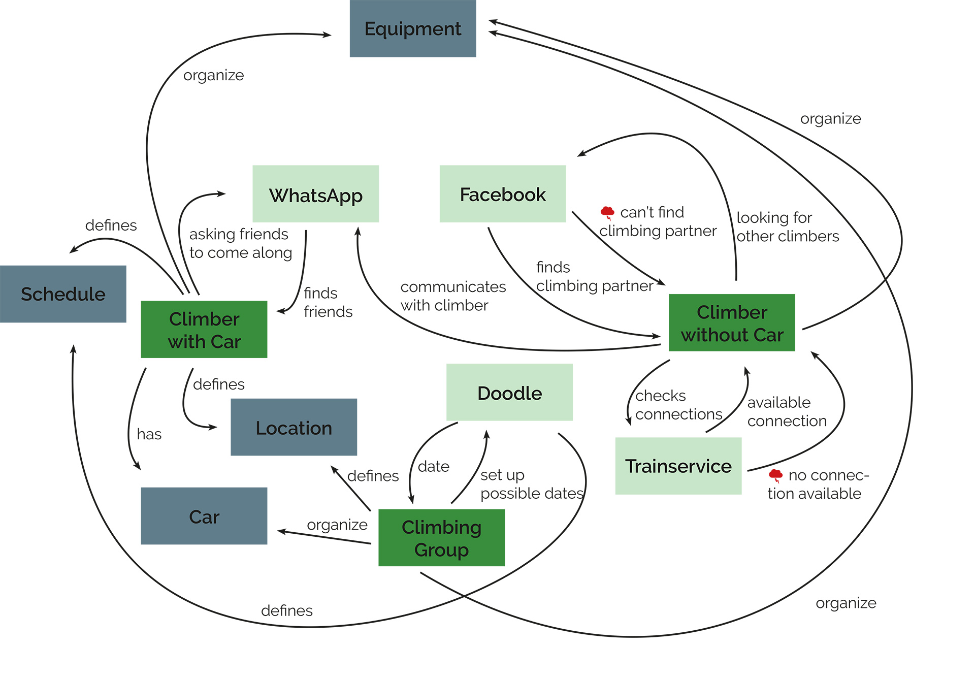
At the start of the project, our only aim was to create an app that supports climbers. In what way? We didn’t know yet. So, we started by interviewing climbers about what they do when they go climbing, what their needs are and where issues arise. There were a lot of them but the most prevalent was that especially for outdoor climbing, it is difficult to find climbing buddies with whom you feel secure. Moreover, only 50% of the interviewees had a car, so finding a way to get to the climbing spot was a pressing issue. Based on this, we created an initial flow model that showed how climbers today organize their climbing trips. It is a mess of finding buddies at Facebook, trying to somehow figure out how experienced they are, then communicating with them via WhatsApp, making Doodle lists for possible dates, and so on…
The flow model showing the current state of how climbers plan their climbing trips.
We wanted to solve all these issues via an app that allows easy planning of the trips. So, as a next step, we created an envisioned flow model that showed how the climbing trip organization should work.
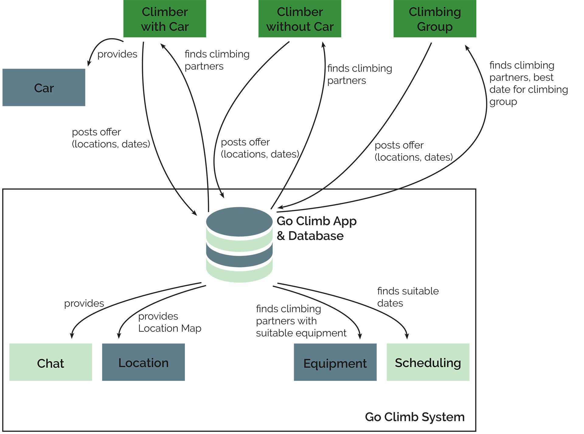
The envisioned flow model shows how the GoClimb system simplifies the process.
Based on the interviews, we created two simple personas (remember – it was a student course) as example climbers to design for. Simultaneously, we created a few typical scenarios and storyboards for these personas.
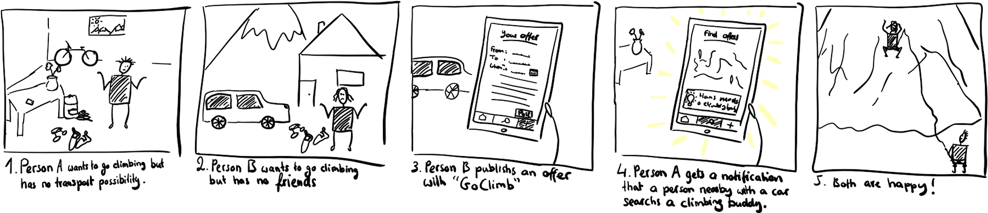
One example of a storyboard we created.
Designing Solutions
Using the various models we created, we started sketching the flow of the app and created initial wireframes for these flows, connecting them to branching storyboards.
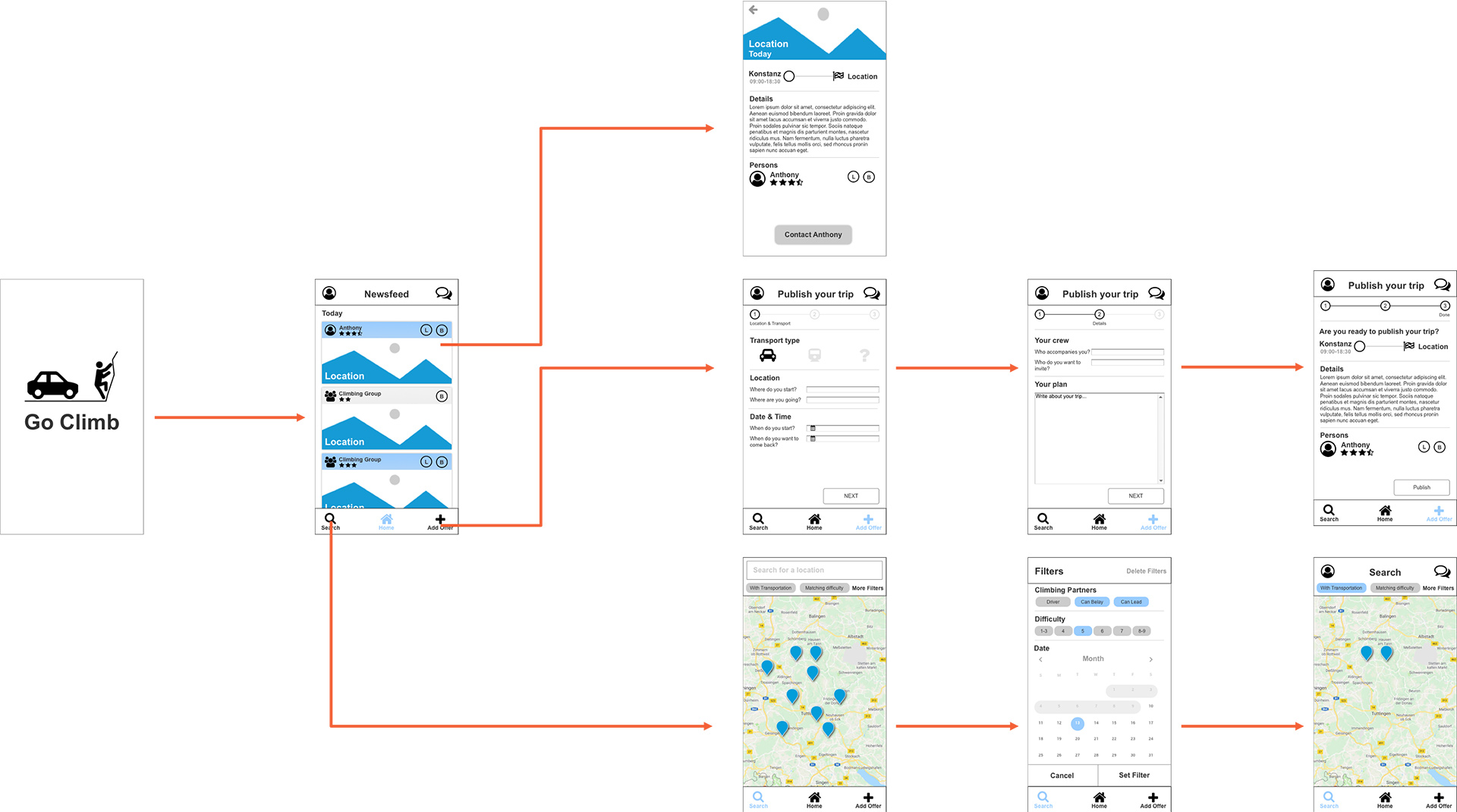
Initial branching storyboard with only few wireframes.
After that, we were at a state where we had to think about the overall aesthetic of the app. We decided to use the material design guidelines of that time and a color palette that evokes the sense of freedom and activity of being in nature. So, we simply grabbed the three main colors from an image that evoked this feeling for us and, based on these, created a few additional shades. I personally think that this works really nicely, also on a metaphorical level: the blue color is used for the background and resembles the static nature, while the orange color that is used for all interactive UI elements comes from the climber – the active element in the image.
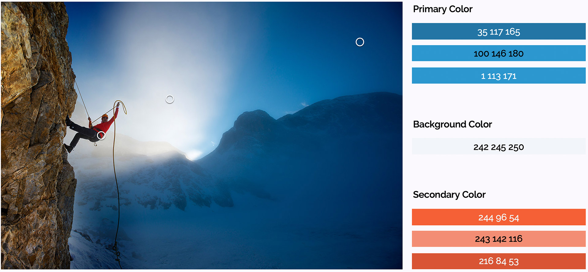
An image of a climber in the mountains served as inspiration and source for the primary, secondary, and background colors of the app.
And then we were good to go and started designing all screens in Sketch using Material Design templates which lead to an overall consistent and appealing app design. I, personally, think it is a shame that this app does not exist in reality! 😉
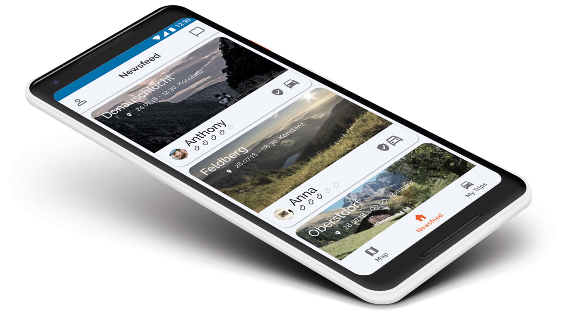
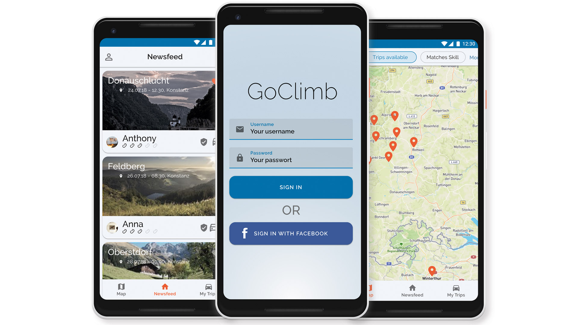
An example screen from the app shows an overview of all available trips created by other climbers.
Used Tools
Below, you’ll find a non-extensive list of tools I used in this project.
Hardware
Google Pixel 2, Apple iPhone 7
Software
Sketch, Figma
Languages
None